TL;DR
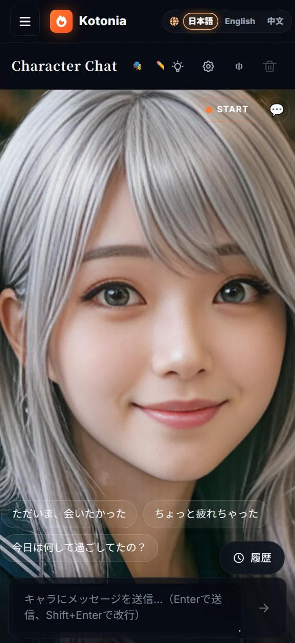
My AI character chat app (Kotonia) bills itself as voice-first. Yet when I opened it on a phone, a 96-pixel mic button and the caption "tap to start talking" were sitting dead-center at the bottom of the screen.
That wasn't a bug. It was a structural self-contradiction. The moment a "voice-first" product puts a "switch into voice mode" button in the middle of the screen, the UI quietly announces "voice is optional, actually."
This post is about how a bug report that started as "the mobile screen is broken" ended up as a product-philosophy reckoning.
It began as a plain mobile CSS bug
The first message I got was just this:
The character chat is broken on mobile when the avatar is on. Look into it.
Digging in, .voice-grid had a single column on mobile and both children (the avatar pane and the chat pane) had height: 100%. CSS Grid happily split that 50/50 via its default align-content: stretch, so:
- Avatar pane → only half the body was visible vertically; the face got crushed toward the center
- Chat pane → the transcript had
flex: 1, but the mic button (96px) + composer + status text + hint took ~250px at the bottom, leaving roughly 90px of readable area
Neither pane was usable.
First fix: B-layout (the Reels grammar)
The lazy fix would be grid-template-rows: minmax(40vh, 45vh) 1fr — avatar on top, chat on the bottom (option A). But the option B I floated was:
Make the avatar a full-bleed background and float the transcript / control as a translucent overlay on top. The portrait-video grammar of Reels / TikTok.
The user picked B. I shipped it, sent a screenshot, and the reply was:
80% of the screen still gets covered with chat and overlay. The cute avatar is doing her best to talk to me, but I can't actually focus on her.
So even with B, the avatar and the voice were supposed to be the stars, but the screen was still dominated by text. The conversation pivoted from physical UI to product philosophy.
The mic-button suspicion
The user's next line was the turning point (paraphrasing only lightly):
The big bottom button only exists because we want "start conversation" to be obvious. If it just started in active mode from the get-go, this button and the "tap to start" copy and all that dead space could be cut.
Translated into product terms: A "voice-first" product that puts a "switch into voice mode" button in the middle of the screen is contradicting itself.
Because:
- "Voice-first" means voice is the default, not an option
- If it's the default, "switch into voice mode" is not an action that exists
- The giant centered button is declaring "voice is a sub-feature that activates only when you press this thing"
- That isn't voice-first. It's voice-as-feature
Pi.ai and Sesame work because they start with voice on and the UI is minimal. To even pretend to be in that league, the big button had to die.
Three redesign decisions
After a back-and-forth, we went with:
1. Kill the giant mic button completely
The bottom MicButton, the status <p>tapToStart</p>, and the <p>VAD is listening</p> hint — all deleted. The bottom now just has the composer (text input) and a send button.
2. Merge state + start/stop into a top-right statusPill
<button onClick={handleSessionToggle} className="voice-statusPill">
  <span className="voice-statusPill-dot" />
  <span>{voiceState === "stopped" ? "START" : voiceState.toUpperCase()}</span>
</button>
This single pill does three jobs:
- Shows the state (a pulsing dot for LISTENING / THINKING / SPEAKING)
- Tapping starts or stops the session
- The previous duplicate "status badge" in the top-right of the avatar got merged into this same pill
3. A cinema / chat mode toggle
Persisted in localStorage, toggled by a 🎬 / 💬 button in the top-right:
- cinema (default): transcript hidden. Avatar fills 90% of the screen. Just composer + suggestion chips at the bottom.
- chat: transcript overlaid at the bottom (max 48vh) with a backdrop-blur panel. For when you actually want to re-read what was said.
This was the cleanest way to serve both "I want to read the chat" and "I want to focus on the avatar" personas in one UI. (I considered a linear opacity gradient toward the center, but that turns readability into a binary, so I rejected it.)
4. The launch trigger is "the moment the user expresses intent"
If the big button is gone, when does the session actually start? Answer:
- Tap a suggestion chip → auto
startSession() - Send something in the composer → auto
startSession() - Tap the top-right statusPill → directly enter voice (for the "no-chips" power user)
Intent declaration and session launch get compressed into a single action. The "preamble button to enter voice mode" no longer exists.
The result
Top right: the START pill (orange dot when stopped; blue / purple / orange pulses depending on the active state) and the 🎬 ⇄ 💬 mode toggle. The bottom is a slim strip with chips and composer. The middle 90% belongs to the avatar — nothing else competes.
"Voice-first product" now means the same thing in the UI as in the marketing copy.
What I learned
"Voice-first" is not a tech-stack choice. It's a UI allocation choice.
Using Whisper, caring about TTS quality, tuning LLM latency — those things support voice-first, but they aren't voice-first themselves.
The actual qualification for the label is whether voice owns the center of the screen in the UI, and whether text input is sized like an auxiliary tool. That allocation decision is what earns the label.
If there is a "switch into voice mode" button, the claim is a lie
This test generalizes beyond voice:
- If an AI product has a big "ask the AI" button, it's not AI-first; it's AI-as-feature
- If a realtime product has a "start realtime" button, it's not realtime-first
- If a collaboration product has a "switch to collab mode" button, it's not collab-first
Whatever your product calls its core, that thing shouldn't need to be turned on. It should just already be there.
Bug reports are a litmus test for product philosophy
This whole story started as a vanilla CSS bug report. But it climbed the ladder of abstraction: "mobile CSS is broken" → "B layout" → "still 80% covered" → "mic button suspicion" → "what does voice-first even mean?"
When you're soloing a product, you don't get many chances to ask "is this UI element still earning its place?" Bug reports sometimes carry, alongside the visible bug, a quieter signal that the UI is betraying the product's intent. If you listen for that signal, your judgment can shift three levels of abstraction higher than the original ticket suggested.
Trying to suspect just one giant button per round of "is the product concept consistent with the UI?" might be enough to make your voice-first claim something you can say with a straight face.
Kotonia lives at kotonia.ai. Open /chat/voice on a phone — the big button should be gone, and the avatar should be holding 90% of the screen.